SHIPPING IS ALWAYS FREE
COLORVANTA
ABSTRACT POSTER
& ART PRINT
COLLECTIONS
Every ColorVanta abstract poster collection begins in our studio and is available only through our store. Each series brings together distinctive wall art designs shaped by geometry, rhythm, and deliberate color. The collections below present our abstract posters and art prints as cohesive visual explorations.
COLLECTIONS OVERVIEW
Each ColorVanta collection explores a distinct visual language, developed through repetition, variation, and restraint. Rather than isolated pieces, these works are conceived as coherent bodies of work, where composition, color, and structure evolve within clearly defined boundaries.
Some collections lean toward strict geometry and controlled systems; others allow for softer transitions, organic movement, or atmospheric depth. What connects them is a consistent focus on abstraction, balance, and the expressive potential of color when used with intent.
The collections below are presented as independent series, each with its own rhythm and visual logic. Individual fine art prints from these collections are available through the ColorVanta EU and US stores. All collections are produced as archival-quality Giclée fine art posters.
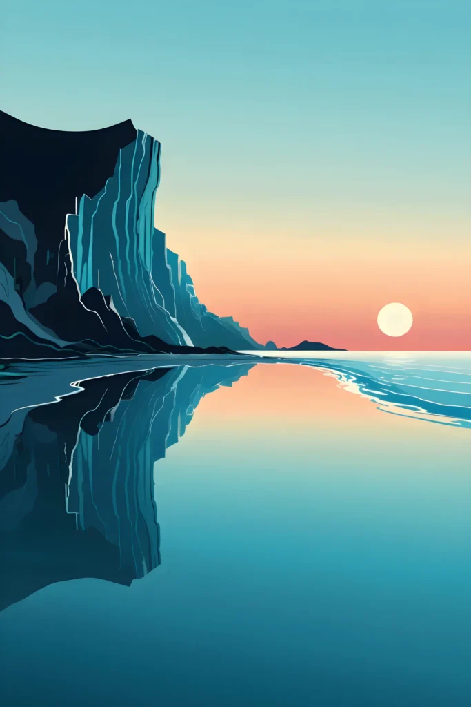
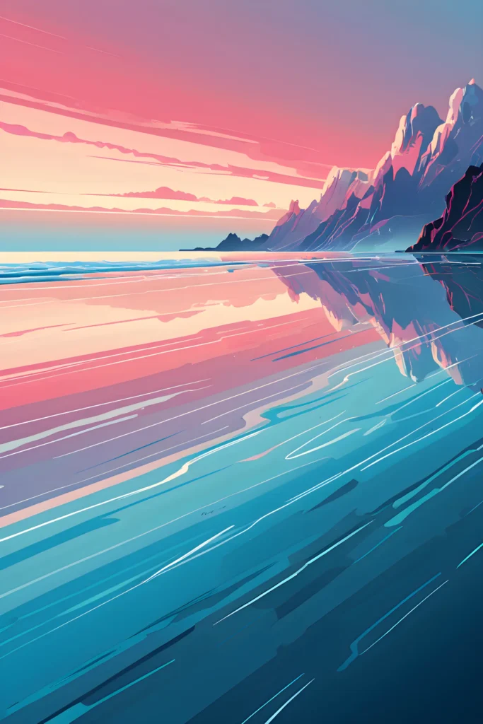
HORIZON FLOW
HORIZON FLOW is an abstract coastal sunset poster collection defined by horizon lines, flowing water, and smooth color transitions. Each piece explores how movement can emerge from minimal structures, where flowing lines and smooth transitions define the image more than explicit detail.
Throughout the series, the horizon acts as a constant point of reference, while the surface of the water becomes a field of variation. Reflections extend, fragment, and adapt to subtle shifts in the composition, creating a continuous connection between foreground and distance.
The collection moves across different states of balance. Some compositions emphasize stillness and open space, while others introduce stronger directional forces through curved shorelines, vertical reflections, or more concentrated forms. These variations remain contained within a consistent visual language, where color, line, and structure are carefully controlled.
Gradients play a central role, allowing transitions between warm and cool tones to unfold gradually, without abrupt contrast. This approach reinforces a sense of calm while maintaining clarity and depth.
Rather than focusing on a single interpretation of the coastal landscape, HORIZON FLOW explores a range of compositions unified by rhythm, continuity, and restraint. Each piece stands independently, while contributing to a coherent and structured whole.


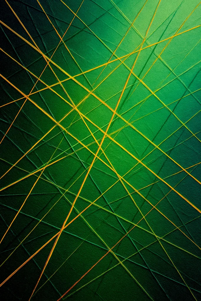
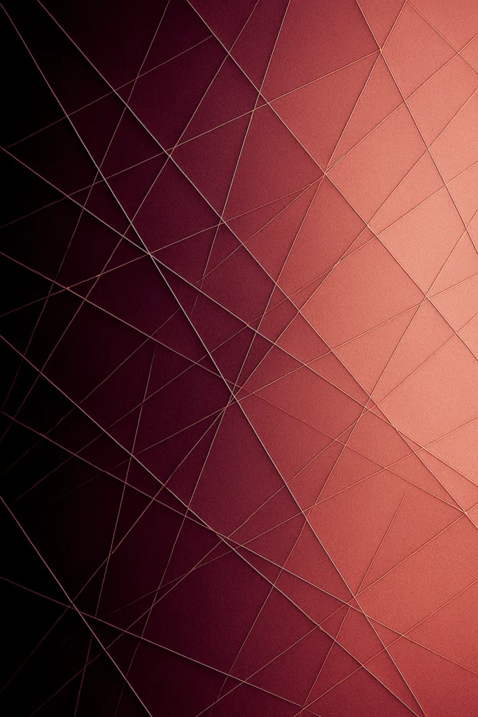
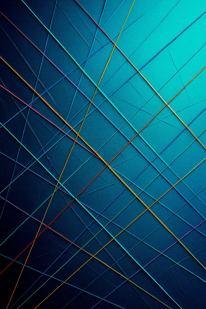
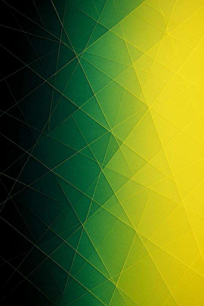
SPECTRUM GRID
SPECTRUM GRID is a wall art collection built on the meeting of color gradients and intersecting lines. Each work begins with a shifting field of gradients — dusk blues, solar yellows, copper warmth, or mint clarity — surfaces that suggest atmosphere, transition, and light in motion.
Across these grounds, a lattice of fine lines emerges. At times the lines are subtle, echoing the hues beneath them, barely separating figure from ground. At other times they flare into vivid strands — red, gold, turquoise — cutting across the surface like charged filaments.
The series holds these two impulses together: restraint and intensity, calm and voltage. The grid is never static. It bends with the spectrum, drifts with the gradient, and turns geometry into movement.
What unites the collection is a sense of balance between order and flow, structure and radiance. SPECTRUM GRID is less about depicting forms than about embodying the invisible currents of light — held, for a moment, in stillness.
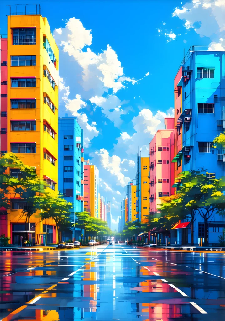
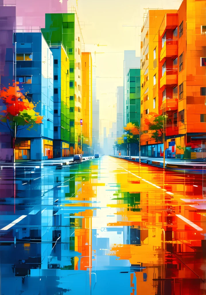
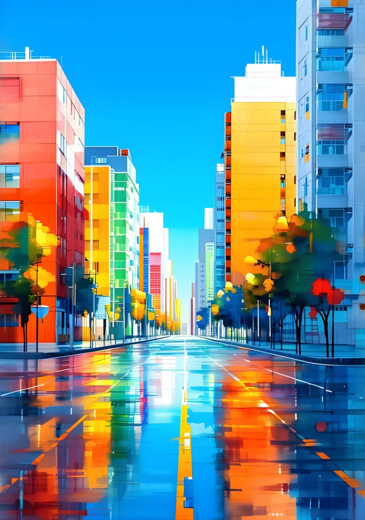
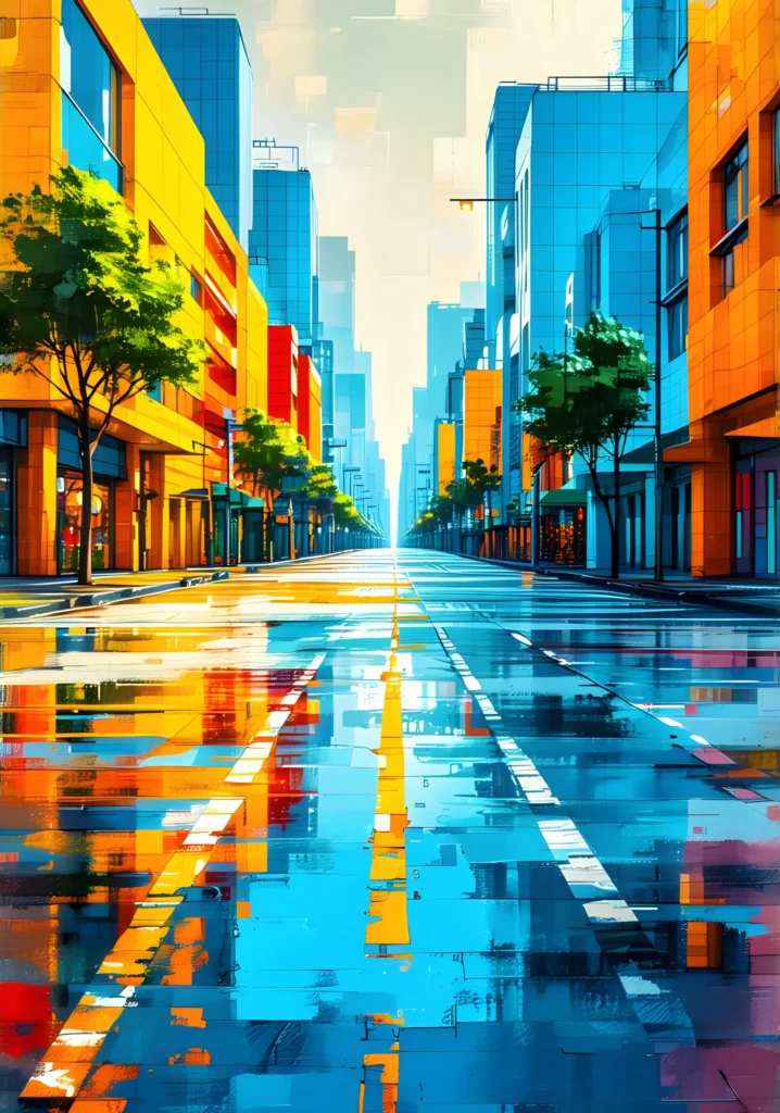
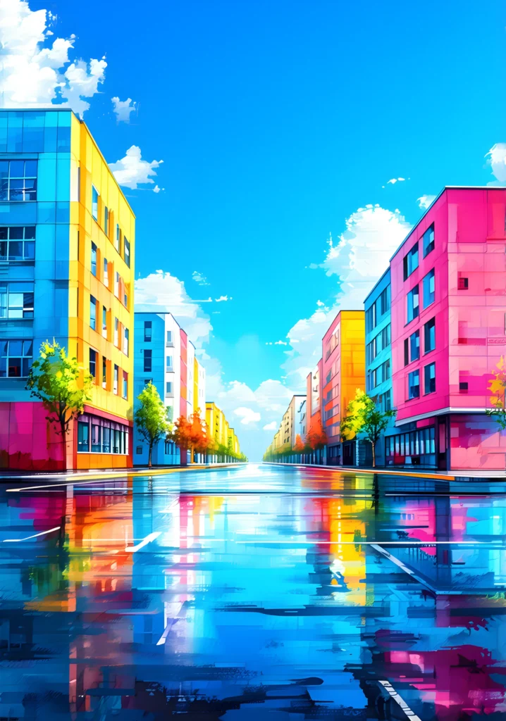
CHROMATIC AVENUES
CHROMATIC AVENUES is a colorful abstract cityscape poster series exploring the city as a sequence of passages shaped by color, light, and perspective. Rather than depicting specific places, the collection presents urban avenues as chromatic structures — spaces where architecture, atmosphere, and surface interact through reflection and rhythm.
Set in the moments surrounding rainfall, these works capture the city in transition. Pavements remain wet and reflective, skies shift between suspension and clarity, and color moves freely across façades, glass, and ground. Each avenue becomes a visual corridor, defined not only by its direction but by the way light is absorbed, held, or released.
Across the collection, the focus shifts between openness and enclosure, horizon and verticality, sky and surface. Some compositions emphasize expansive skies and wide urban breathing spaces, while others compress the scene into dense, introspective passages where color accumulates within structure. Together, they form a continuous narrative of movement through the city — not as a fixed destination, but as an evolving experience.
Rather than isolating individual hues, CHROMATIC AVENUES treats color as a living element. It flows, reflects, and settles, shaping the emotional tone of each work while maintaining a coherent visual language across the series. The avenues are calm yet vibrant, ordered yet fluid, familiar yet abstract.
This collection invites the viewer to move through the city slowly — to follow the central axis, observe the shifting light, and experience the urban landscape as a chromatic journey defined by transition, balance, and quiet momentum.
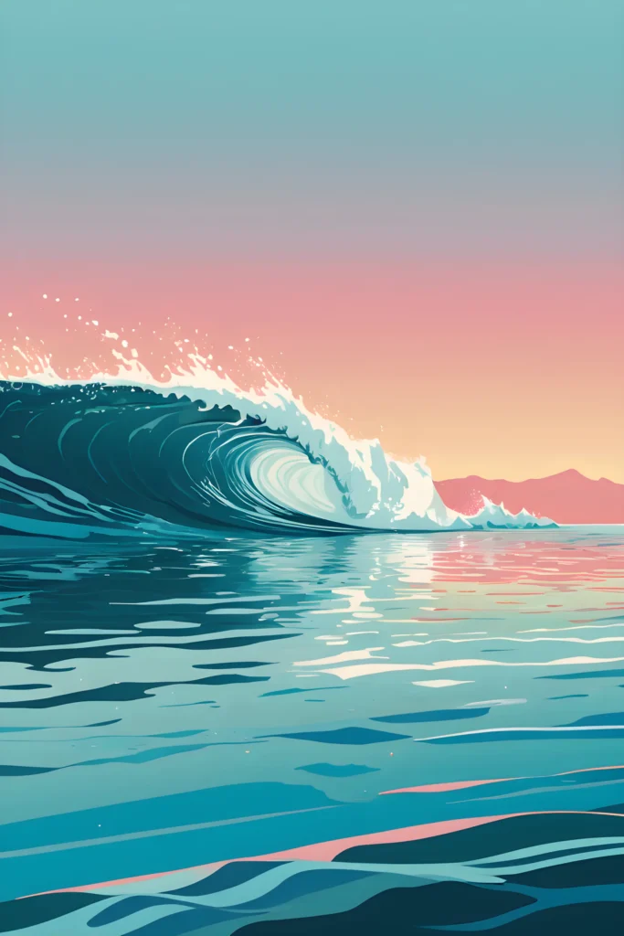
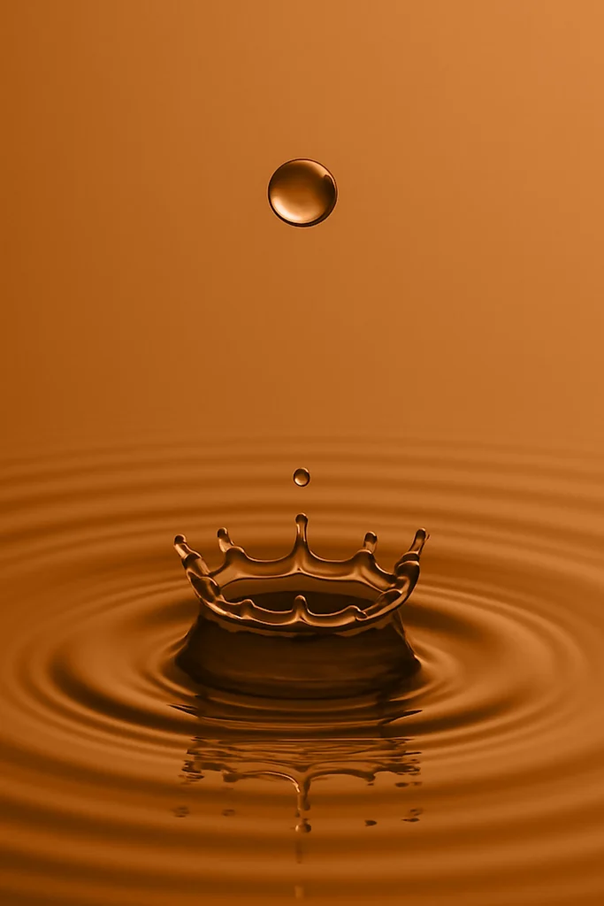
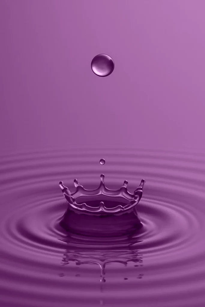
DROP
DROP is a minimalist water-inspired abstract art print series centered on the precise instant where motion meets stillness.
Each composition explores the quiet geometry of a droplet touching water, capturing an event that lasts less than a second and transforming it into a sustained visual presence. The impact itself is almost secondary; what matters is the balance that follows — the subtle expansion, the rhythm that emerges, the silence that settles.
The series investigates color as atmosphere rather than subject. Color is not decorative, but structural: it defines mood, depth, and emotional temperature, shaping how the image is perceived rather than what it represents.
Minimal in form yet expansive in feeling, DROP operates through restraint. A single focal point, a controlled surface, and the repetition of concentric ripples create a visual language that is calm, precise, and contemplative.
Every ripple becomes a quiet pulse, every reflection a trace of time unfolding outward. DROP is less about the fall of water than about the balance it reveals — that fragile calm after movement, the point where motion dissolves into stillness.


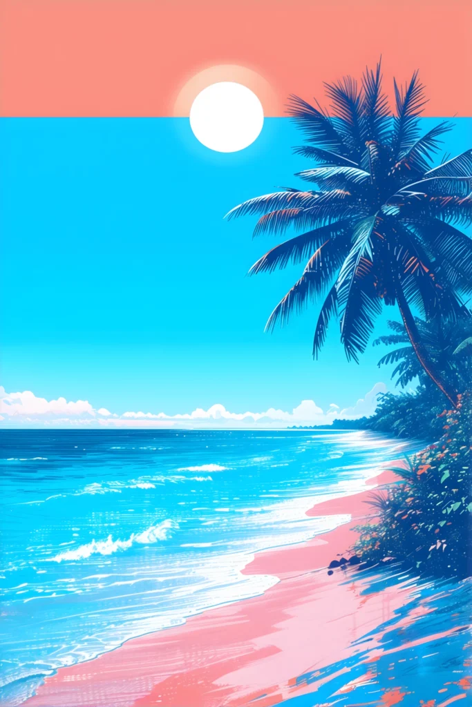
TROPICAL POP COAST
TROPICAL POP COAST is a tropical beach wall art series built on contrast, color, and deliberate composition. Rather than depicting specific places, the collection explores the idea of the tropical shoreline — reduced, intensified, and re-assembled through graphic language.
Across the series, palm trees are consistently positioned to one side of the composition, acting as both anchor and counterweight. This structural choice creates open horizons, asymmetrical balance, and a recurring sense of direction — as if each scene is observed from the edge, never from the center. The coast becomes a threshold rather than a destination.
Color plays a central role. Saturated pinks, electric blues, warm yellows, and deep shadows are not used descriptively, but expressively. They define mood, rhythm, and depth, often limiting each composition to a restrained palette that amplifies visual impact while maintaining clarity. The result is POP in intensity, yet controlled in structure.
Graphic marks, layered textures, and subtle artifacts are intentionally preserved. These elements reinforce the constructed nature of each image, reminding the viewer that these landscapes are designed as much as they are imagined. Calm water surfaces coexist with energetic skies; stillness is constantly balanced against visual tension.
While immediately striking, TROPICAL POP COAST is not meant to be consumed at a glance alone. Each piece rewards slower viewing — revealing relationships between color fields, compositional layers, and the dialogue between organic forms and geometric intervention.
This collection sits at the intersection of wall-ready POP art and thoughtful graphic composition.
It evokes heat, light, and distance — not as postcards of paradise, but as bold visual interpretations of coastal presence, atmosphere, and balance.


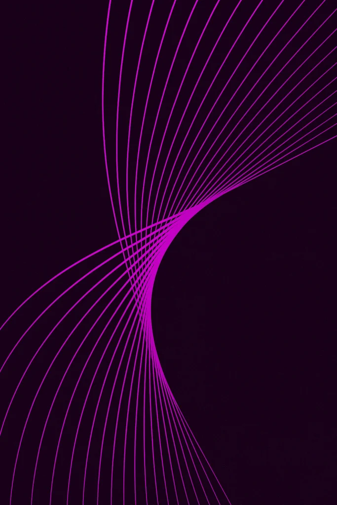
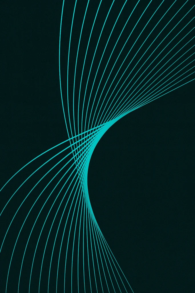
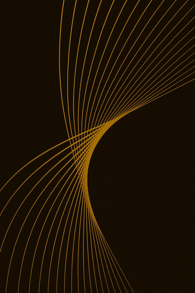
FLUX
FLUX is a contemporary line art poster collection — a series where color becomes energy, traced through the precision and elegance of line.
Each composition is built upon the same underlying structure: a field of parallel lines that curve, narrow, and release, forming a quiet torsion within a disciplined geometric framework. The structure remains constant, yet its expression is never static. What changes is not the form itself, but the force that animates it.
The repetition of parallel lines is deliberate and almost architectural, establishing order, rhythm, and balance. Within this rigor, however, the lines bend and breathe, suggesting motion that resists containment. What emerges is not mere repetition, but transformation.
Minimal by design, the compositions reduce visual language to its essentials. This restraint allows subtle variations to take on weight: the tension between compression and expansion, the sensation of flow across space, and the way color alters the perceived direction and intensity of movement.
Rather than depicting motion, FLUX embodies it. The works exist in a state of continuous transition — poised between control and release, geometry and emotion. Each piece reads as a distinct interpretation carried through the same structural logic.
FLUX is not about stillness. It is about the persistence of energy within order — a reminder that even within strict lines, movement never truly comes to rest.
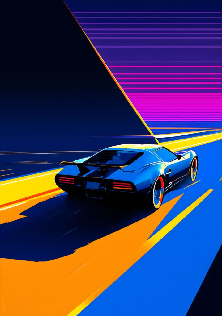
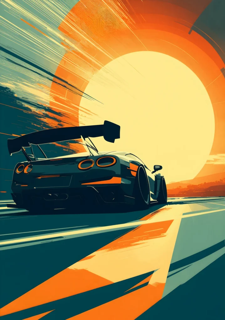
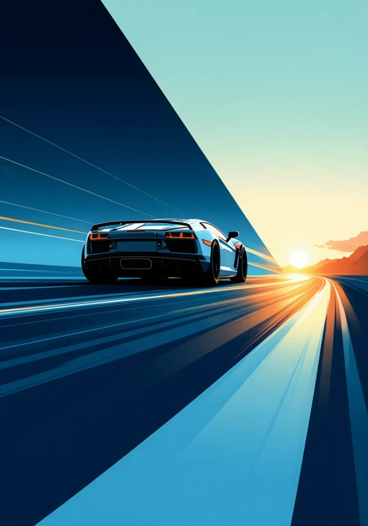
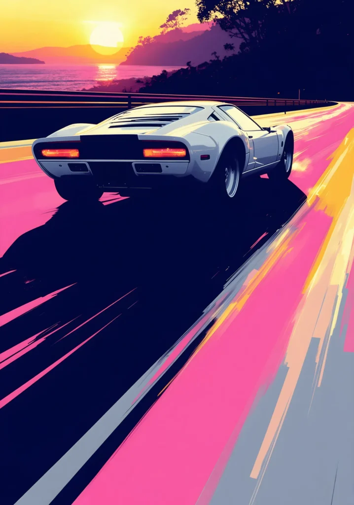
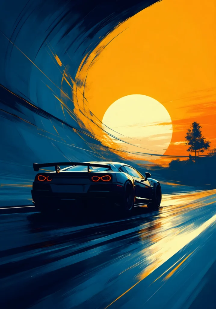
SUNSET ROAD
SUNSET ROAD is a graphic automotive poster series exploring movement, direction, and light through a design-driven visual language. Rather than depicting specific places or moments, the series focuses on structure and sensation — using the road as a graphic axis, the car as a stabilizing form, and the sunset as a source of orientation and tension.
Across the series, compositions are built around strong diagonals, controlled perspective, and bold color relationships. The road is rarely neutral; it becomes an active surface, sometimes expansive and luminous, sometimes restrained and directional.
This shifting emphasis allows each piece to explore a different rhythm — from acceleration and intensity to calm progression and distance — while maintaining a cohesive visual identity.
The car, consistently viewed from behind or at an angle, functions less as a subject and more as a reference point. It establishes scale, anchors movement, and reinforces direction without imposing narrative.
In the same way, the sunset is not treated as a literal sky element, but as a compositional force: at times dominant and radiant, at others distant and reduced to a guiding signal.
SUNSET ROAD embraces variation within a shared structure. Some works lean toward high energy and contrast, others toward restraint and clarity.
Graphic stylization replaces realism, favoring clean geometry, saturated planes, and visual flow over descriptive detail. The result is a series that reads as a sequence of visual explorations rather than a linear journey.
As a whole, SUNSET ROAD presents a contemporary interpretation of movement through space — where direction matters more than destination, and progression is defined by light, structure, and rhythm rather than by place or time.
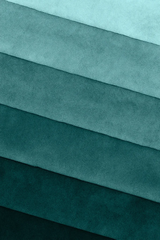
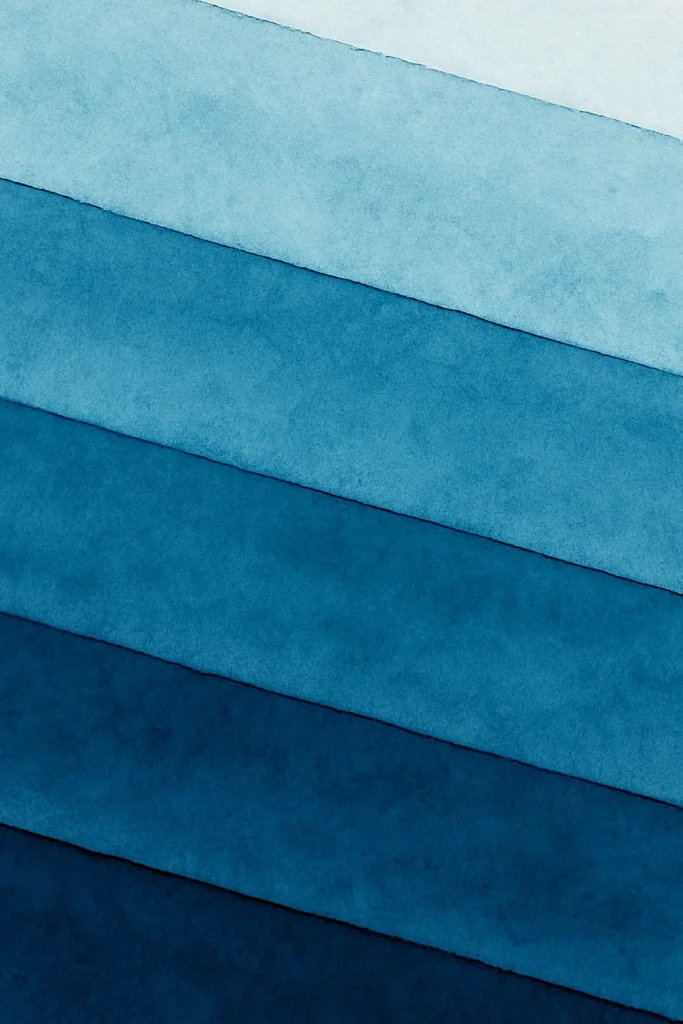
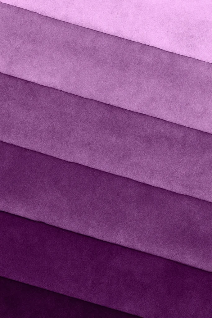
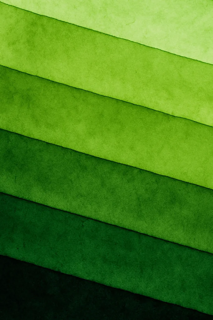
SPECTRAL LAYERS
SPECTRAL LAYERS is a textured, layered abstract art print collection built on repetition, tonal progression, and measured variation. Each work is composed of diagonal bands arranged in a consistent structure, allowing color and texture to become the primary agents of expression.
Rather than relying on contrast or dramatic shifts, the series explores tonal progression — layers moving from darker, weightier hues toward lighter, more diffused ones. The transitions are subtle and continuous, creating a sense of depth through accumulation rather than disruption.
The surfaces carry a soft, granular texture that recalls pigment settling into paper. Edges remain clean but not rigid, preserving a balance between structure and organic variation. Across the series, color behaves less as a statement and more as a material — something that thickens, thins, deepens, or fades with quiet consistency.
While some works lean toward muted, atmospheric palettes and others toward more saturated tones, all pieces share the same underlying logic: a controlled framework that allows color to shift without losing cohesion. Together, they form a spectrum of calm, measured compositions where movement is implied, not enacted, and variation emerges through tone rather than form.
SPECTRAL LAYERS is an exploration of how minimal structure can sustain richness — how repetition, when carefully tuned, becomes a space for nuance rather than limitation.

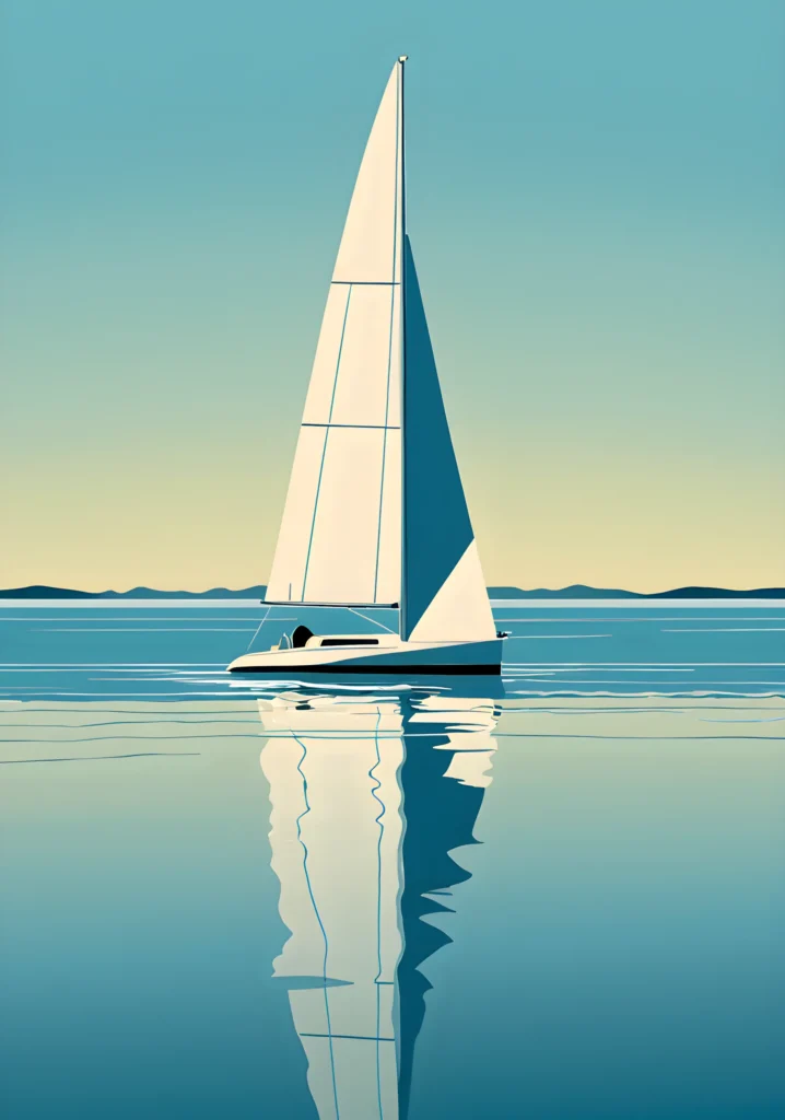
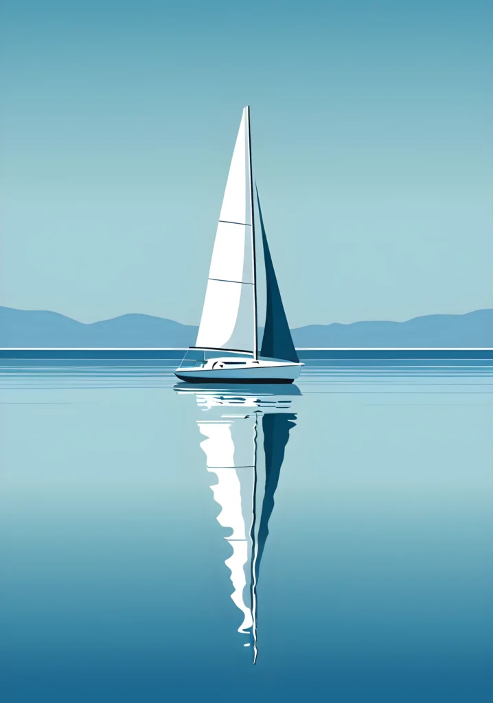
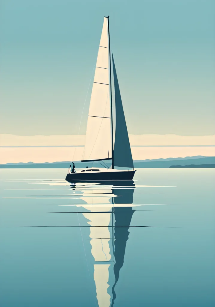
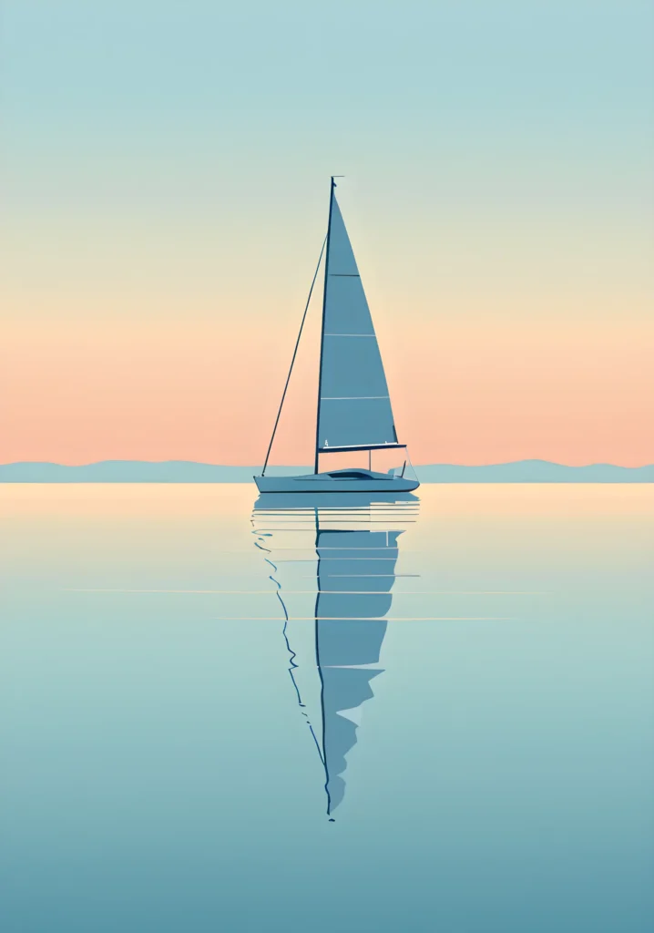
BLUE STILLNESS
BLUE STILLNESS is a coastal wall art collection centered on calm, balance, and suspended time.
Across this series, blue is not treated as a single color, but as a continuum — shifting from deep, quiet tones to lighter horizons softened by subtle warmth. These transitions do not suggest movement or narrative progression, but rather the coexistence of stillness and change within the same moment.
Each composition centers on a solitary sailboat, positioned with restraint and clarity. The boats are not depicted in motion; instead, they appear anchored in silence, held between sky and water. The absence of wind, waves, or dramatic contrast allows space to become the dominant element.
Reflections play a central role throughout the series. The water acts as an extension of the image rather than a surface, elongating forms and introducing gentle distortions that prevent perfect symmetry. This mirrored structure reinforces a sense of continuity, where the boundary between object and environment becomes intentionally blurred.
The horizons remain low and distant, often softened by minimal variations in tone. Occasional hints of warm light — pale rose or muted gold — appear not as focal points, but as quiet accents within the dominant blue palette. These moments introduce emotional depth without disrupting the overall calm.
BLUE STILLNESS does not aim to depict a specific place or time. Instead, it invites contemplation — of balance, presence, and quiet awareness. The series offers images that do not demand attention, but reward it, revealing subtle variations in structure, color, and atmosphere the longer they are observed.
Together, the works form a cohesive visual field where repetition becomes variation, and stillness becomes the subject itself.

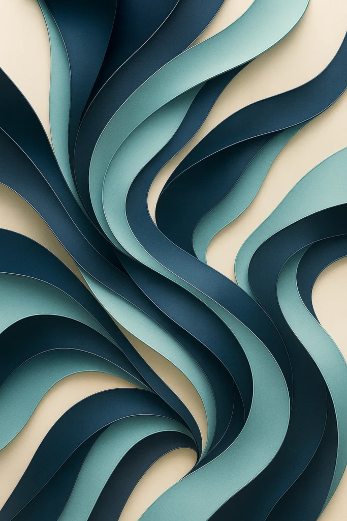
RIBBONS
RIBBONS is a flowing abstract wall art series exploring motion as a continuous visual condition. Across the series, layered bands curve, overlap, and separate, creating compositions where rhythm and continuity replace direction and narrative.
The forms feel suspended in an ongoing state of transformation — neither static nor expressive in a literal sense. What emerges is a balance between tension and fluency, where layered structures guide the eye through gradual transitions instead of focal points.
These compositions do not seek to represent natural phenomena or symbolic gestures. Instead, they investigate how repetition, variation, and spacing can generate presence and depth within an abstract framework. Motion here is quiet, contained, and persistent.
Viewed together, the series establishes a coherent visual language built on continuity and subtle change — one that invites slow observation and allows each piece to resonate without imposing a fixed meaning.
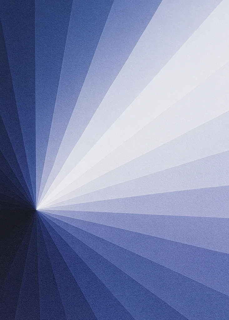
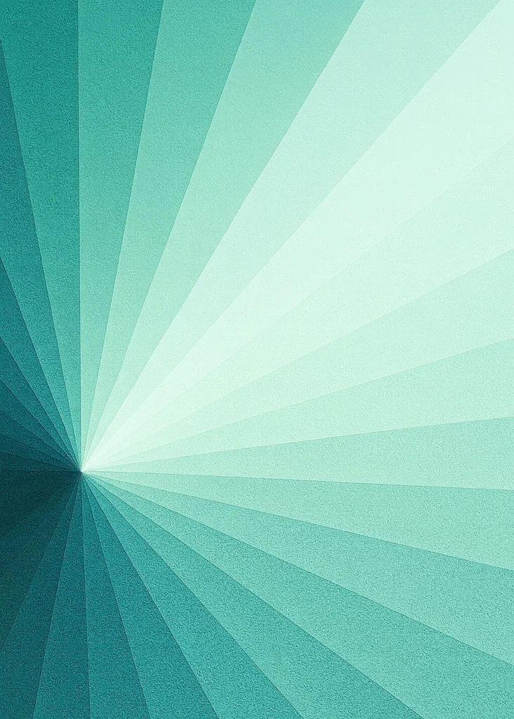
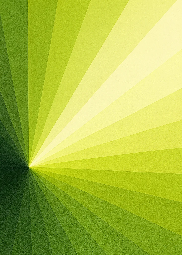
RADIAL GRADIENT
RADIAL GRADIENT is a geometric sunburst wall art series built around a single, insistent gesture: light that does not remain still, but radiates outward. Each composition emerges from an off-center origin — a point of compression where shadow gathers before unfolding into brightness. From this displaced center, color expands in structured rays, creating a sense of motion that is both controlled and expressive.
Geometry plays a central role. The radial structure introduces precision and order, while subtle tonal transitions soften its rigor, allowing color to breathe and evolve across the surface. What begins in density gradually opens into clarity, transforming darkness into luminosity through a continuous, measured flow.
The movement is constant, yet never repetitive. Although the underlying structure remains consistent, each work interprets the passage from shadow to light in its own way, giving the series a quiet internal variation and rhythm.
The title Radial Gradient reflects this dual nature. Radial refers to the geometry of rays expanding from a displaced center, anchoring each composition in a precise spatial logic. Gradient speaks to the smooth, uninterrupted progression of color — a transition rather than a boundary, an unfolding rather than a contrast.
These works are not static surfaces, but visual expansions made visible. They transform geometry into rhythm and color into narrative, capturing the act of opening itself — a controlled release of light, ordered yet alive.


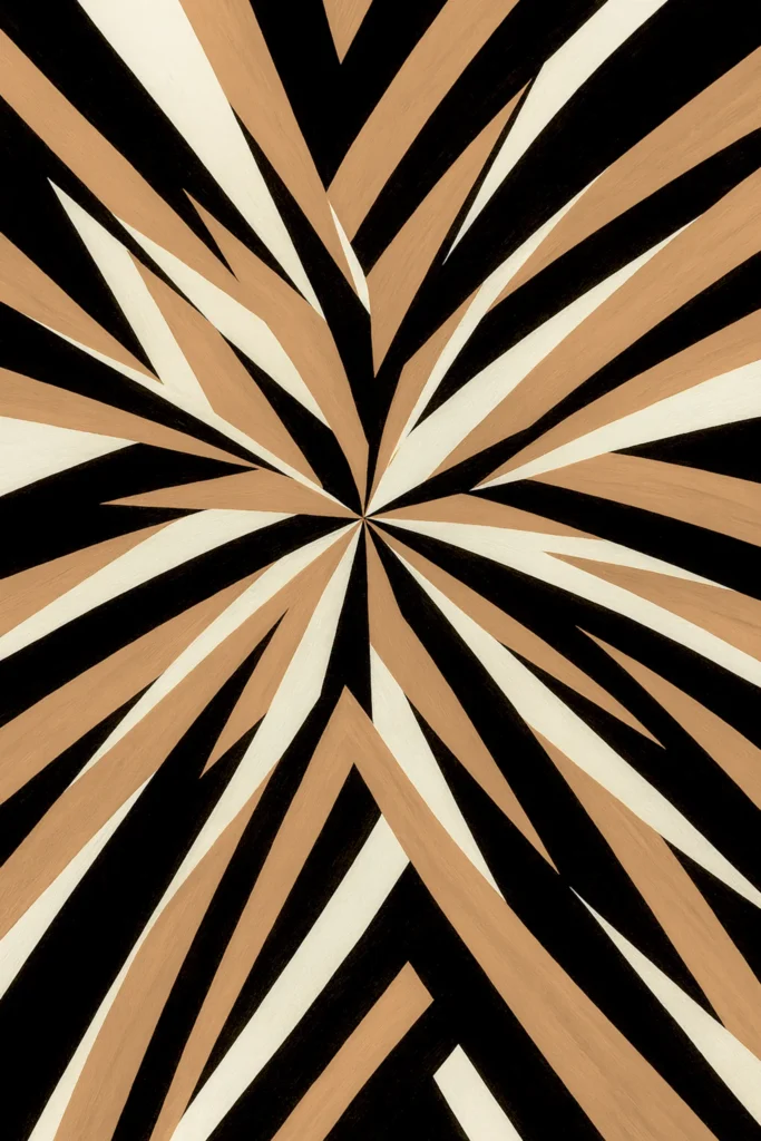
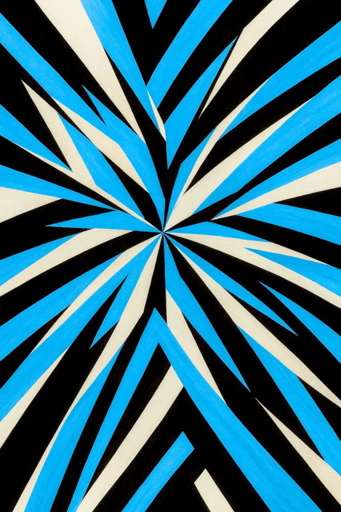
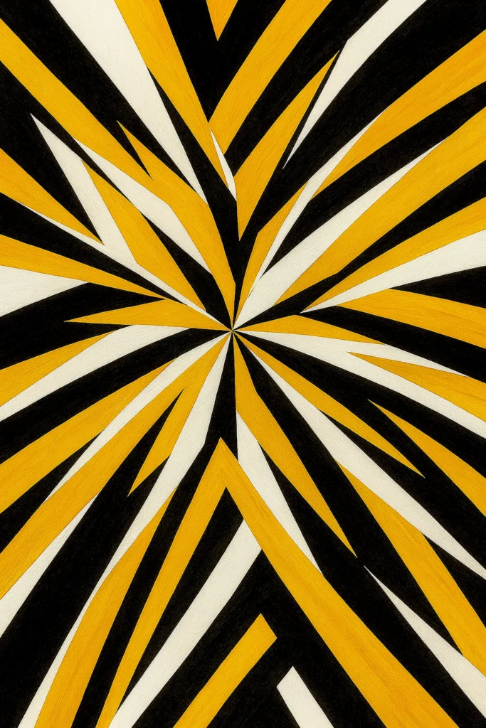
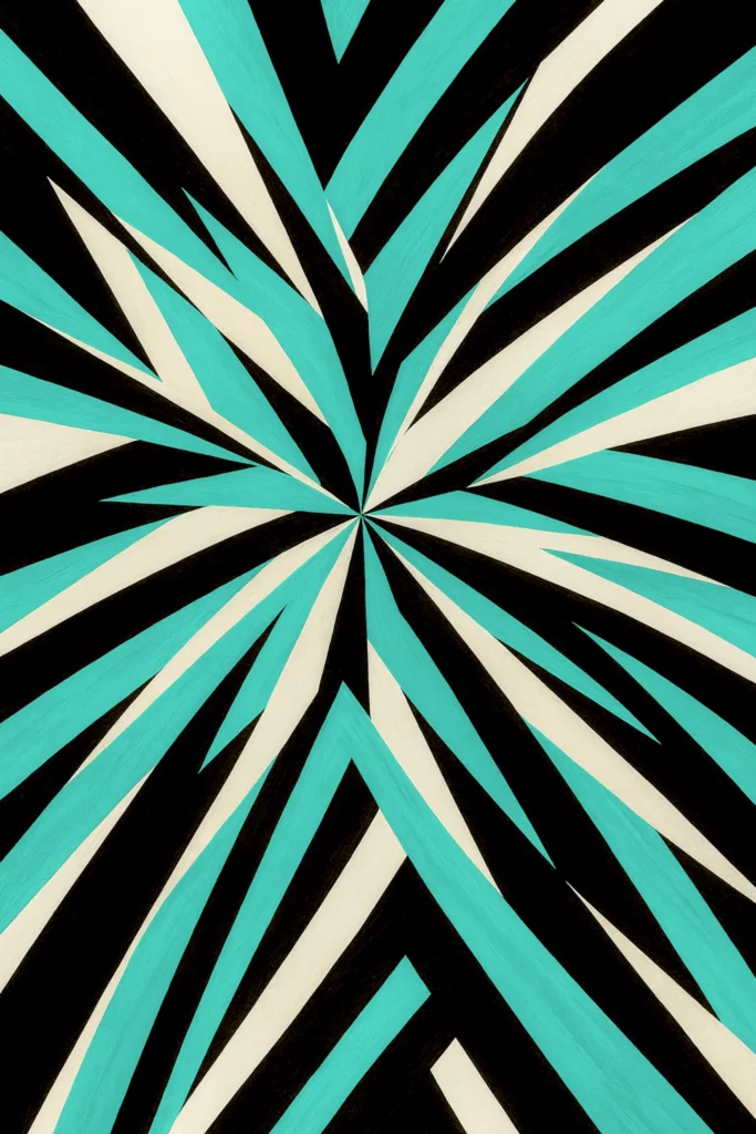
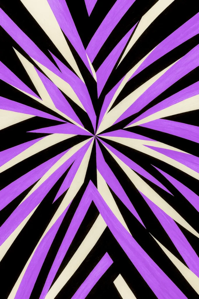
FOCAL POINT
FOCAL POINT is a geometric abstract poster series built around a single visual origin — a focal point from which structure and energy radiate outward.
In design, the term describes the element that anchors a composition, guiding the gaze toward its essential core. Here, it becomes both a structural device and a metaphor: a centre that holds balance while releasing energy.
Across the series, the language is one of contrasts — between order and spontaneity, stillness and expansion, light and depth. Each composition reveals a different state of tension, yet all share the same pulse: the quiet power of focus unfolding into movement.
FOCAL POINT is not about colour alone, but about direction — how form and intensity can transform a moment of concentration into pure visual rhythm. The result is a collection that feels deliberate and alive, a reminder that from one spark, infinite variations can emerge.
HEXAGONAL PULSE
HEXAGONAL PULSE is a geometric abstract wall art series exploring the meeting point between structure and fluid motion. Across the series, a repeating hexagonal framework acts as a stabilizing structure, while organic, water-like forms move freely within it, creating a dynamic tension between precision and flow.
The compositions are inspired by natural rhythms — reflections on water, shifting currents, and subtle variations of light. Aquatic tones dominate the series, with blues, greens, and turquoises forming a calm yet energetic visual language. These hues emphasize clarity, depth, and movement, reinforcing the sensation of continuous motion held within a defined structure.
In selected works, the series introduces inverse or high-contrast interpretations, where intense warm tones emerge against a darker structural framework. These variations expand the visual range of the collection while remaining grounded in the same underlying geometry and rhythm.
Rather than representing specific places or moments, HEXAGONAL PULSE focuses on sensation: the perception of flow, balance, and repetition. Each piece invites the viewer to slow down and engage with the interplay between light, structure, and motion — a quiet pulse that resonates across the surface of the image.
DUNE
DUNE is a textured sand waves wall art collection shaped by the patterns of wind across desert landscapes. The collection explores the quiet architecture of movement — a landscape where wind becomes geometry and light becomes texture.
Each piece captures the rhythm of sand shaped by invisible forces, reflecting on time, stillness, and the subtle balance between permanence and change. In these works, color replaces matter. Warm and cool tonal ranges interact to suggest earth, air, and distance without relying on literal representation.
The dunes are not landscapes but traces of motion — their curves repeating like slow waves that have come to rest. Every composition is defined by restraint: no distraction, no horizon line, only continuity of form and the quiet vibration of light.
Seen together, the images form a chromatic topography — shifting from warmth to calm, from the tangible to the meditative. It is the point where motion becomes memory, where color and silence converge. Minimal yet deeply tactile, DUNE is an ode to serenity — a collection about what endures when everything else has moved.